

New Project: The Turmeric Co.
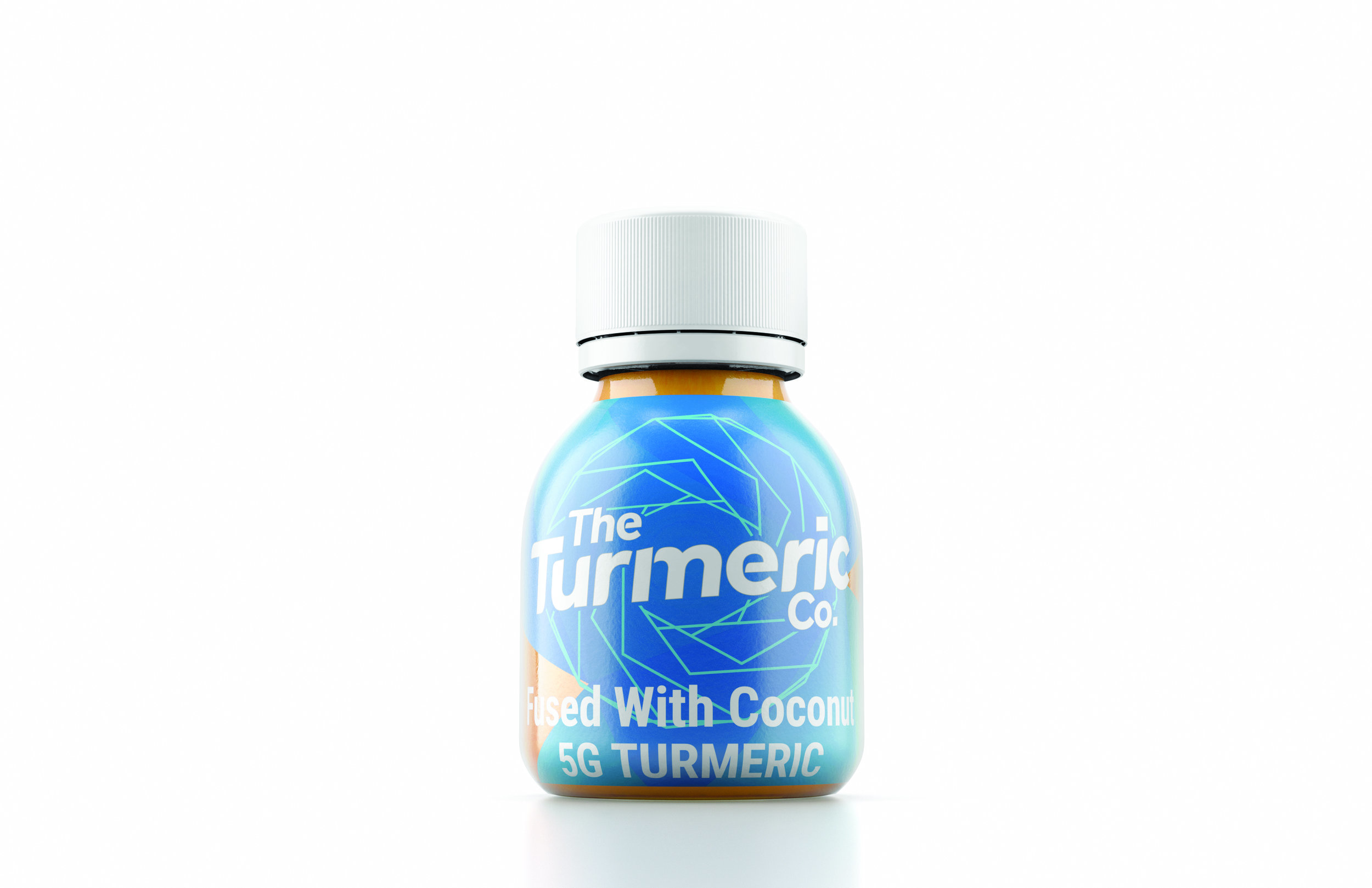

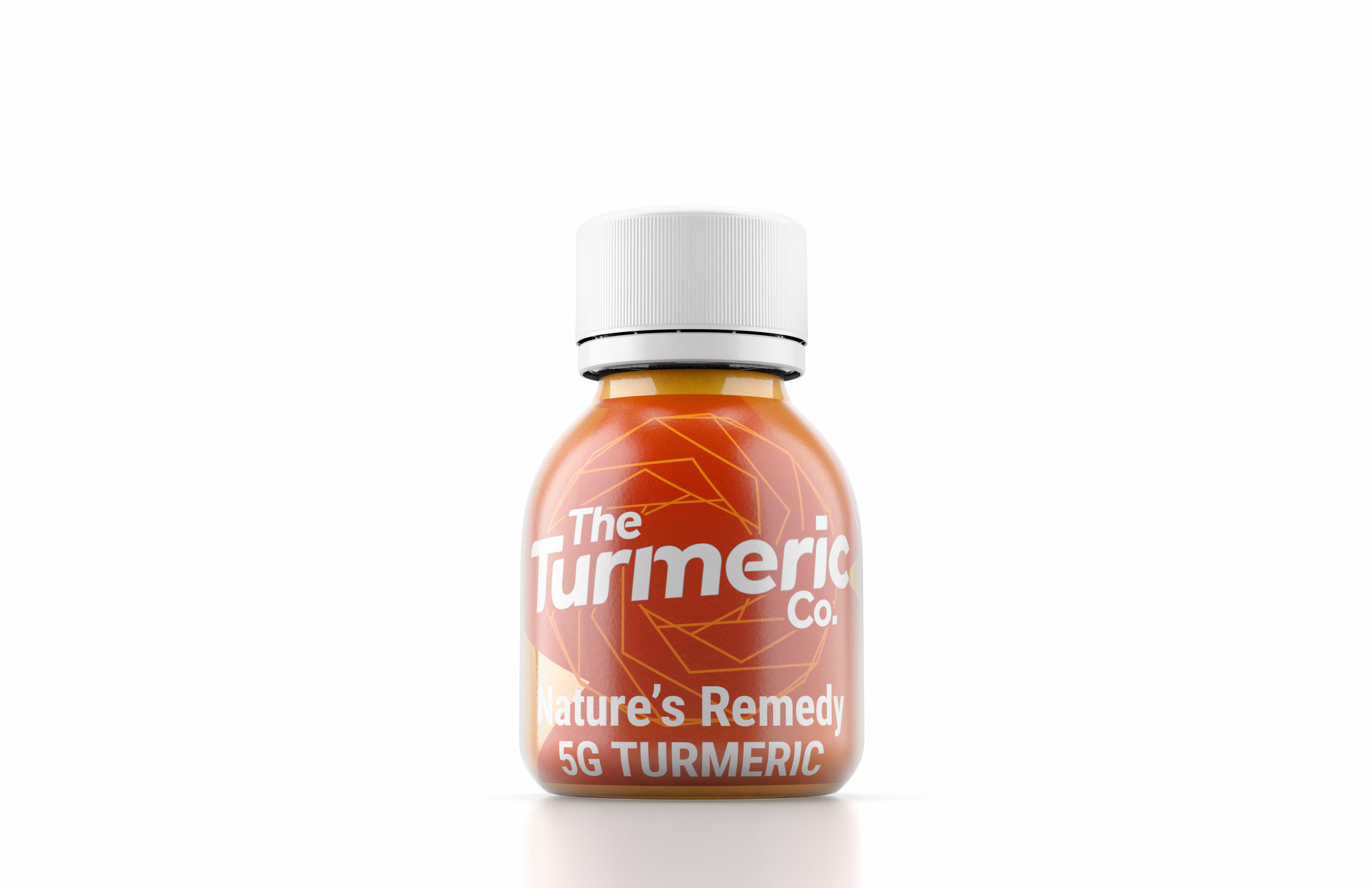
Recently we got to work with a fun young company out of the UK, The Turmeric Co. We were tasked with generating 3D images of their product for their web and trade show needs. The new site is now live and we are so excited to share the visuals our team worked on.

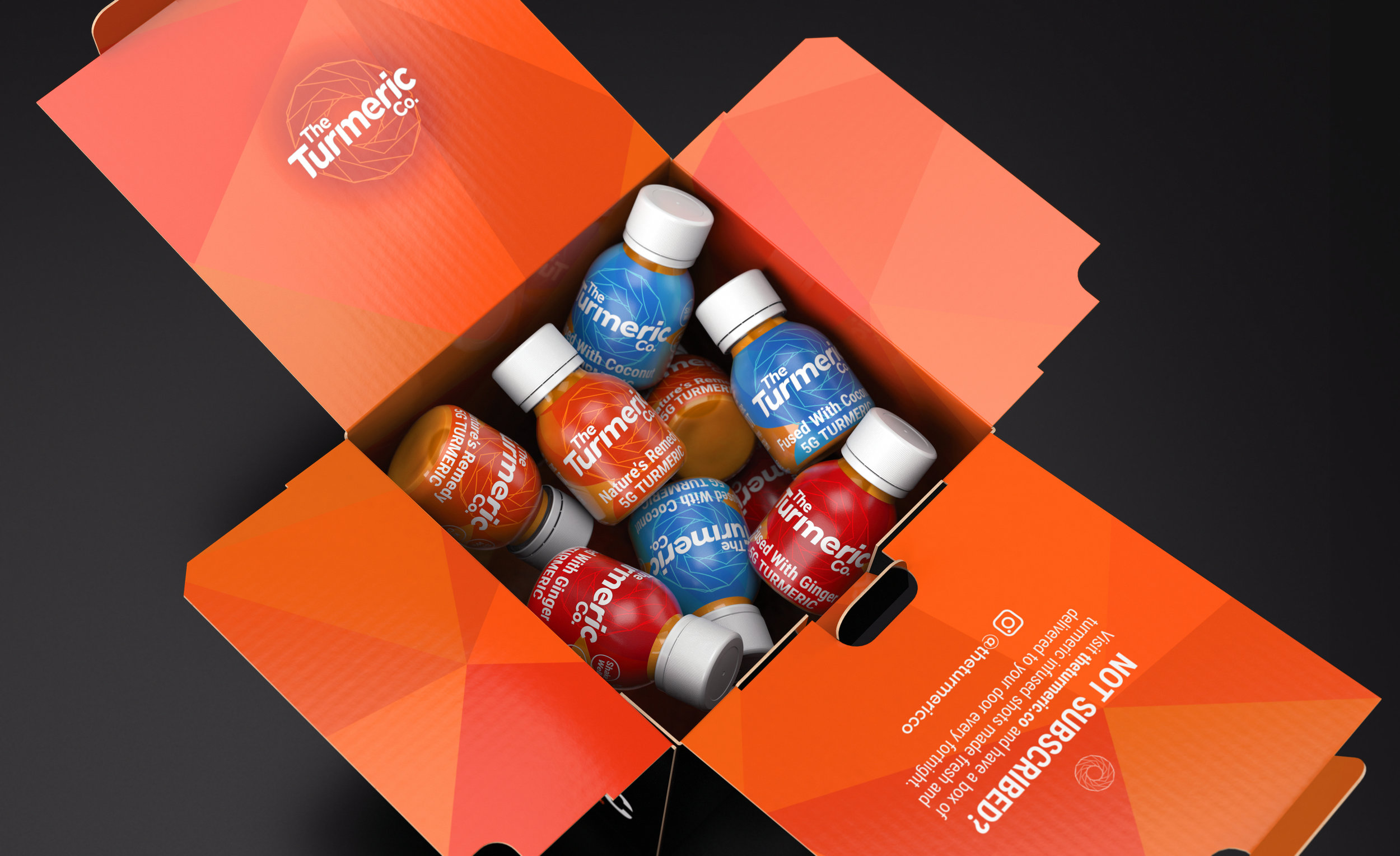
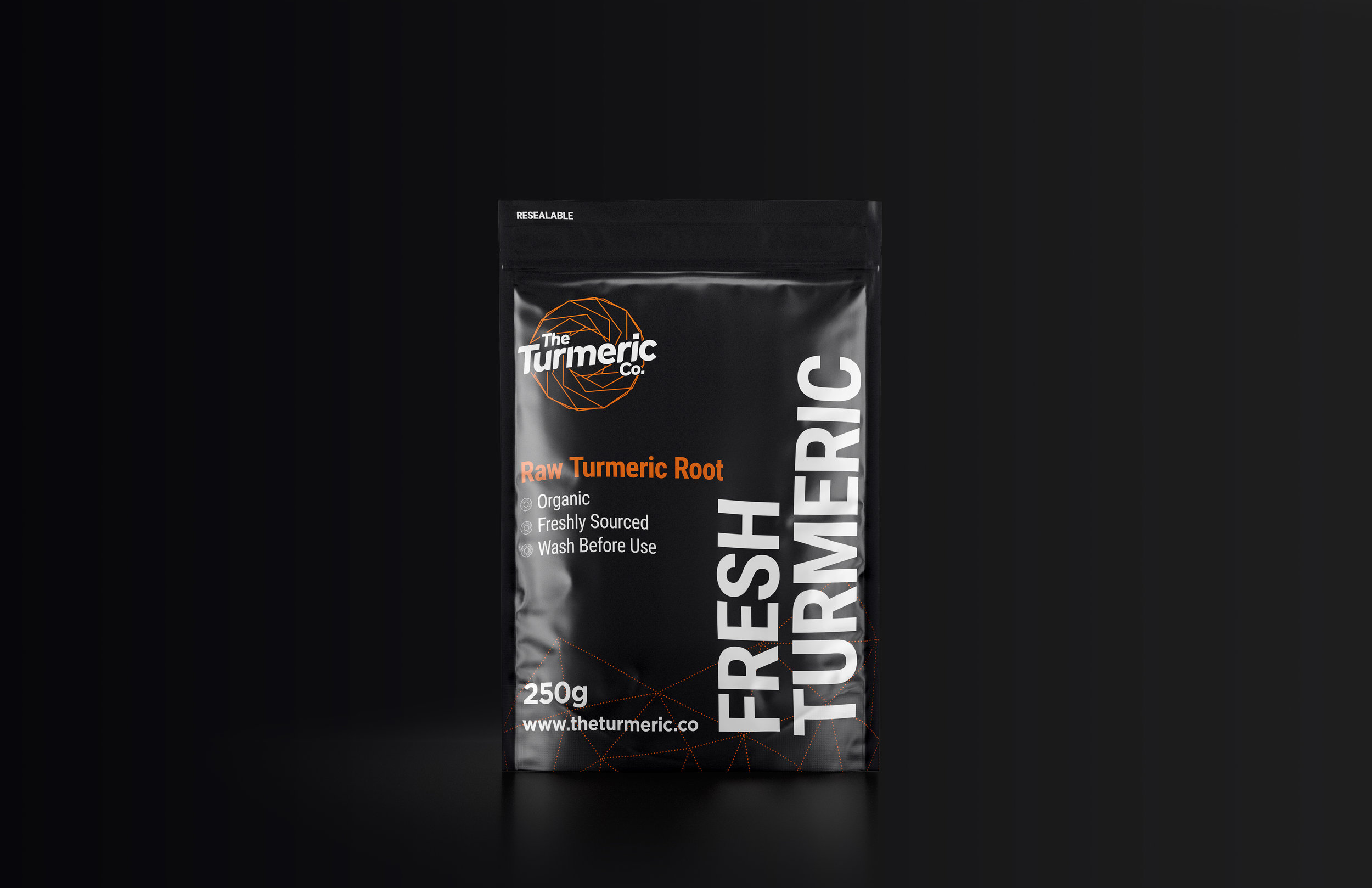
The visuals were created with custom materials and lighting allowing for this unique product to be showcased.
Check out our work on the site below!

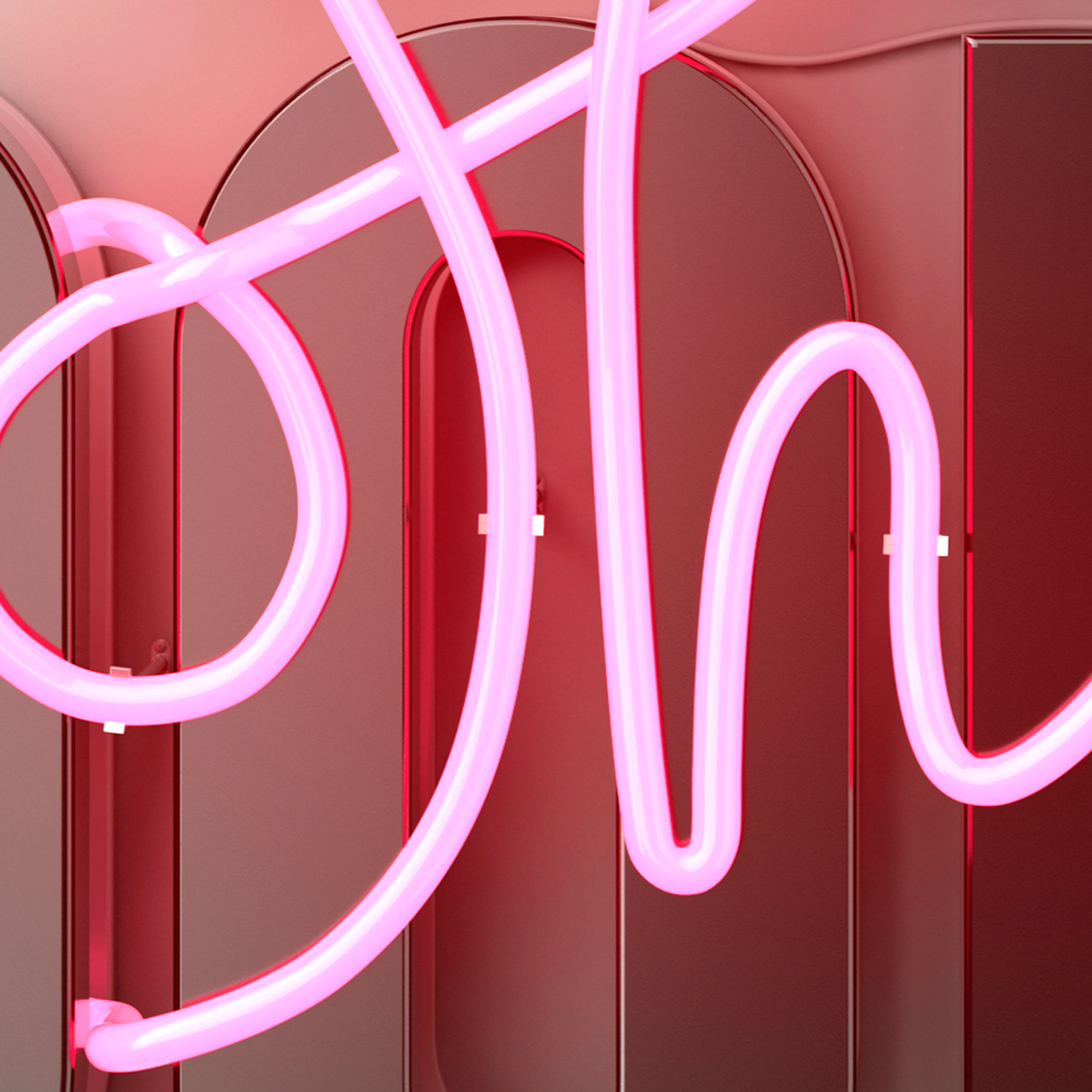
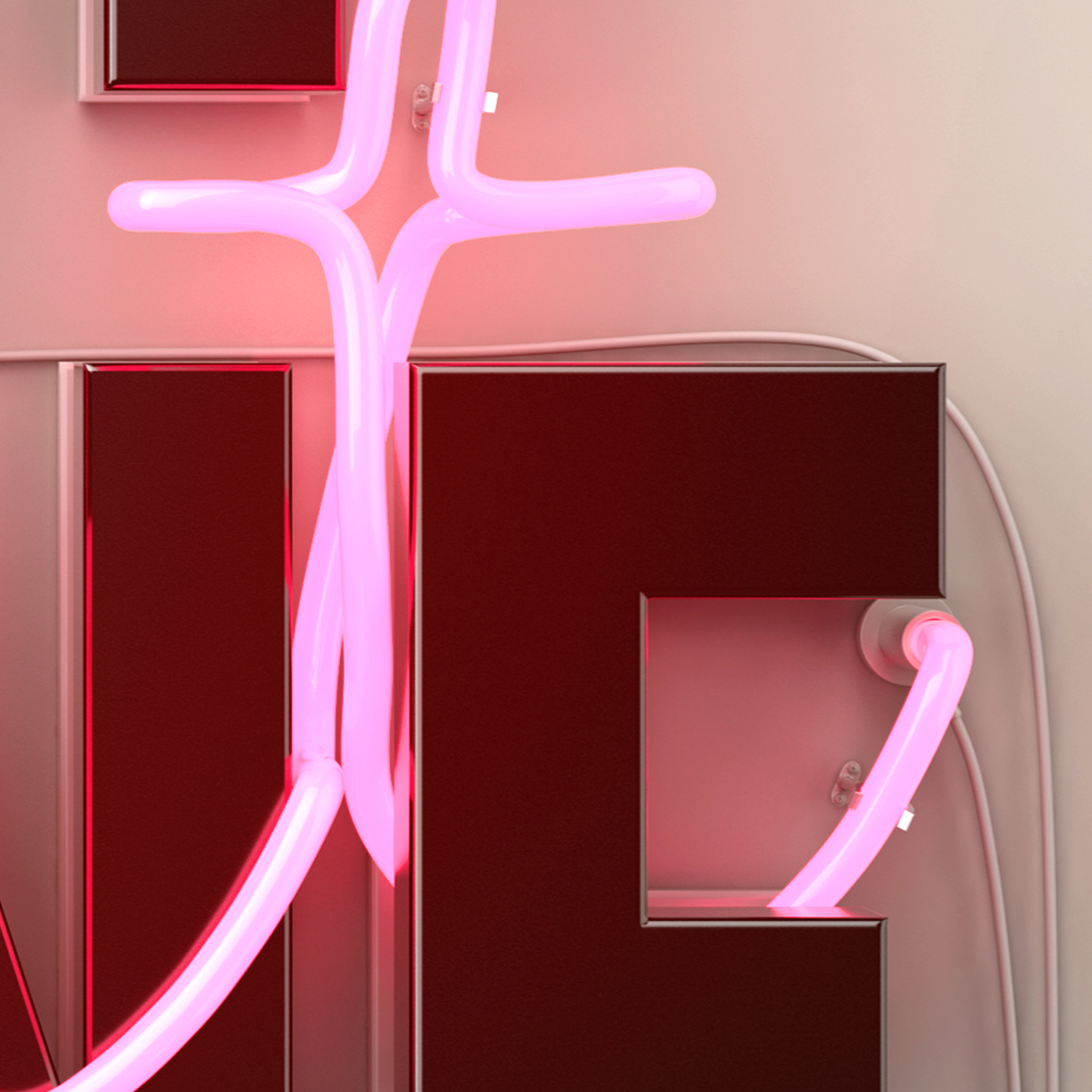
Another Neon Sign (#SorryNotSorry)
Here is another studio project of ours we have been working on behind the scenes! This project specifically was a designer collaboration with Tiffany Moy - and it was a blast!

Having the neon going in and out of the block type was a fun challenge to model out in the studio.


How did we miss this?
"Have we been living under a rock?"
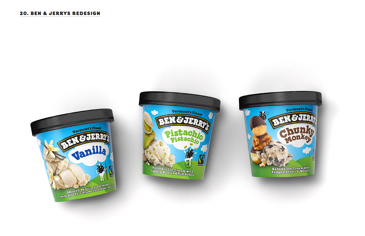
We had that moment this morning and when we realized that there was a recent Dieline article with TWO sets of our visuals on a top 25 list - and we missed it!

#20 Ben & Jerry's: The team worked on each SKU for this range of ice cream packaging. With provided photography we were able to retouch, composite, (digitally paint at times) and stack the ingredients for each SKU.
#21 Blue Bunny: The team was able to provide our client not only with on-pack retouch and composite for various SKUS across the range. We were also able to provide on-pack illustrations across the entire line as well.

If you look closely, there are some familiar looking bars on a new range of packaging. *Cough* *Cough*
All designs were provided by our clients. It was a blast to work with them on these projects. Congrats on the shoutout!
Showcasing Various Printing Effects Through 3D Modeling

Attention to detail when developing and applying materials and lighting is key to creating any realistic 3D visual. When dealing with materials and lighting, without enough detail and focus the visuals can look a bit ‘off’. But, too much focus can sometime result in the visuals looking overly produced and artificial.
So, when a client came to us a while back with a new design for Penfolds’ Holiday Packaging that had a hyper detailed range of printing effects across their structures - we had to pay close attention to every facet to ensure realism.


With the provided dielines and designs, our team 3D modeled each of the elements along with developing unique materials and lighting elements that would best showcase the design and printing effects.

Most the packaging was developed to have a heavy paper texture. Across the range there were multiple uses of heavy embossing, high gloss varnishes and foil stamping and more. On one structure the result needed to look like a faux leather with a gloss topographic pattern (running across the full range) printed into it.
The lighting needed to showcase the nuanced detailing of the structures. The lighting was specially designed by our team for these visuals to showcase and accent the various printing effects as much as the overall designs themselves.


The products and additional elements across the designs needed to be focused on as well. As seen below; wine bottles, on-pack pockets, tags and stationary elements were also developed through 3D software. The materials and lighting applied to the models needed to allow the materials to stand out on their own while still fitting into the rest of the family across the set of visuals being developed.
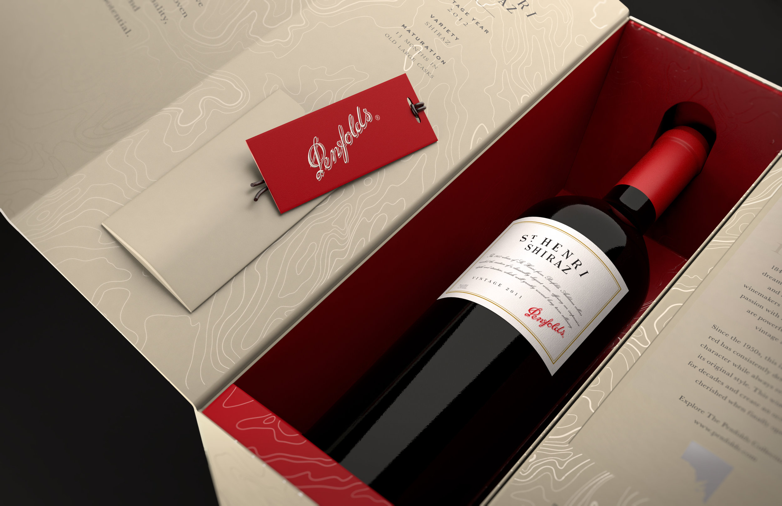
Our teams’ attention to and focus on the range of printing effects and the proper lighting through 3D modeling and rendering process, we could provide our client with hyper-realistic visuals. With these visuals, our client was able to showcase their designs on the web and in the press as the product was hitting the shelves.
To check out more from this project, check out the gallery showcase here. Remember, all designs and dielines were provided by our client.
LV News
In the lyon’s den, the world’s a little more visual, the vision’s a little more brilliant, and quality always rules.
Archives
- October 2019
- September 2019
- April 2019
- February 2019
- January 2019
- November 2018
- October 2018
- September 2018
- August 2018
- July 2018
- May 2018
- April 2018
- January 2018
- November 2017
- October 2017
- August 2017
- July 2017
- June 2017
- May 2017
- April 2017
- March 2017
- February 2017
- January 2017
- December 2016
- November 2016
- October 2016
- September 2016
- July 2016
- April 2016
- March 2016